A bold new direction
A much-publicised demerger for GSK saw the pharma giant refocus its ambitions on leading in R&D and technology. In advance, GSK challenged RY to reinvigorate its corporate website to reflect this bold new direction. The process wouldn’t be straightforward: the website needed to be developed at speed through a process that would consult 150 internal stakeholders along the way.
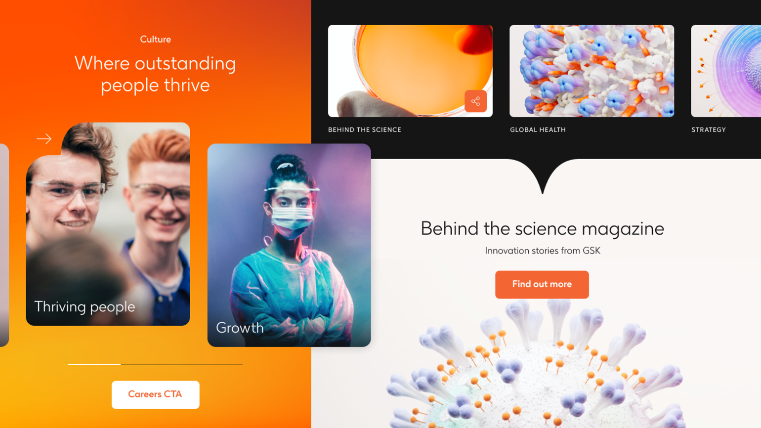
Fluid experiences, captivated audiences
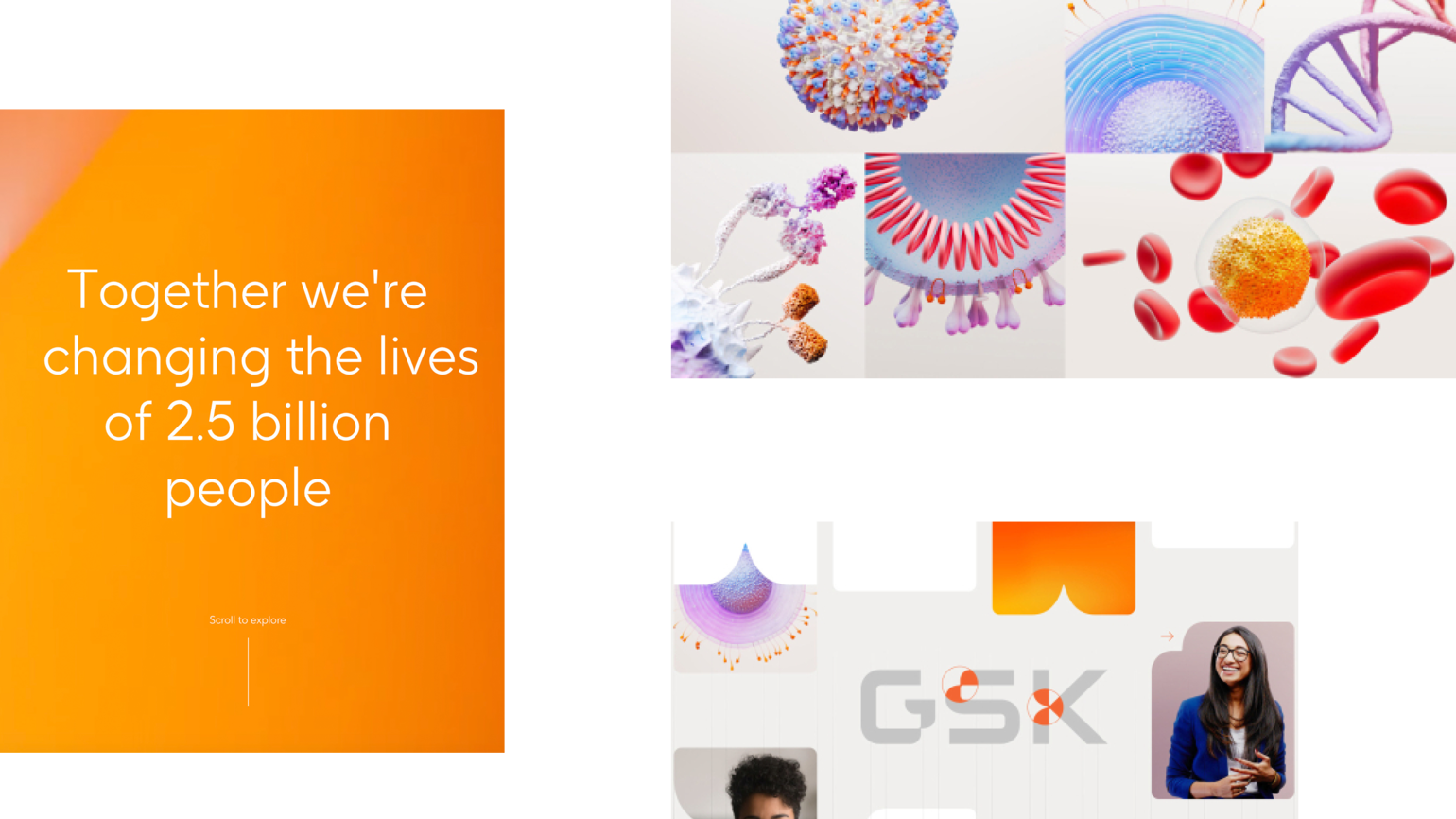
Persona, SEO and analytics data painted a rich picture of the journeys GSK users took through the existing site. This enabled us to profile audience groups and develop a responsive site architecture that would highlight the content that matters most. From there we designed a new, category-defining website that delivers fluid, dynamic experiences for all users. Living, breathing design and Netflix-style content bring palpable energy to every user experience, echoing GSK’s progressive, forward-looking nature.
Continuing to evolve
Since launch, we’ve continued to build on this foundation, strengthening the site’s accessibility, performance, and technical resilience.
Enhancements such as WCAG 2.1 AA compliance, keyboard navigation and screen-reader optimisation have made the site more inclusive and user-friendly.
Media optimisation, code efficiencies and caching strategies have improved load speed and contributed to a significantly better carbon score. The introduction of dark mode also reduced energy consumption on supported devices, lowering the site’s overall carbon impact.
A major platform upgrade migrated the global .com and 19 market sites from Umbraco 7 to Umbraco 13, providing enterprise-level security, ensuring resilience and protection, improved workflows, and a future-ready framework for ongoing digital transformation.
A category-defining website
The website received overwhelmingly positive feedback since launch, including recognition from the Digital Impact Awards and two Gold wins for Best Corporate Website at the Corporate & Financial and IR Society Awards.
Our enhancements over the years have also helped drive a notable uplift in GSK’s standing in the Bowen Craggs Index, underlining the measurable improvements in accessibility, performance and overall digital maturity.
The site sits at the heart of GSK’s corporate communications and reflects the organisation’s renewed strategy, culture, and powerful purpose. The establishment of a formalised design system has also empowered us to roll out the site’s digital experience across GSK’s local sites, digital products and internal channels.