Créateurs de convivialité
As Pernod Ricard looked towards future growth, the drinks giant needed to make sure its brand was fit for the challenge. For decades, the concept of conviviality has been central to Pernod Ricard, but this rich and evocative idea wasn’t coming through strongly in its corporate identity. But the biggest struggle was in deciphering a universal understanding of conviviality – a seemingly impossible task of trying to capture a feeling.

The ‘glow’ of a feeling
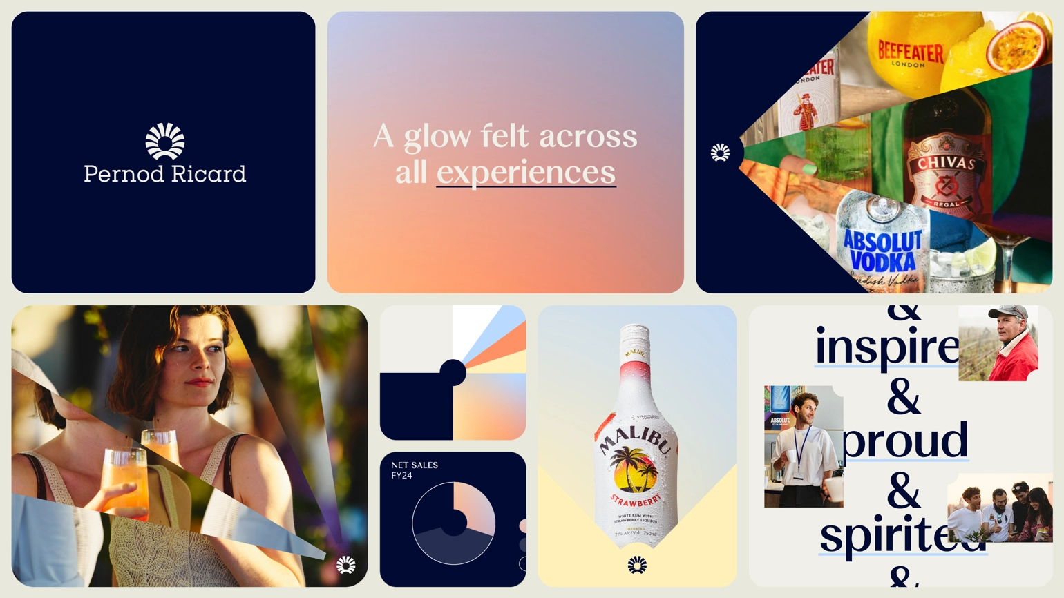
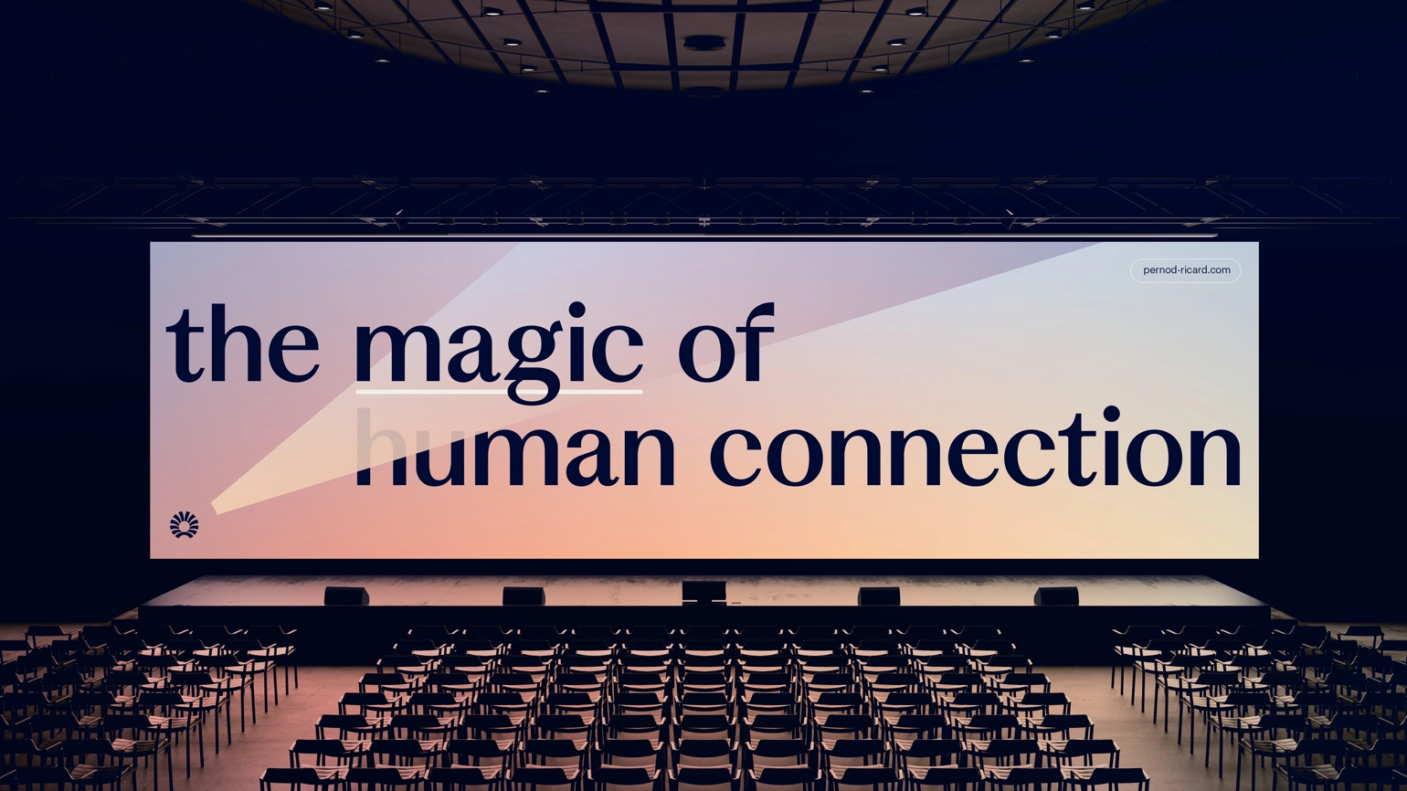
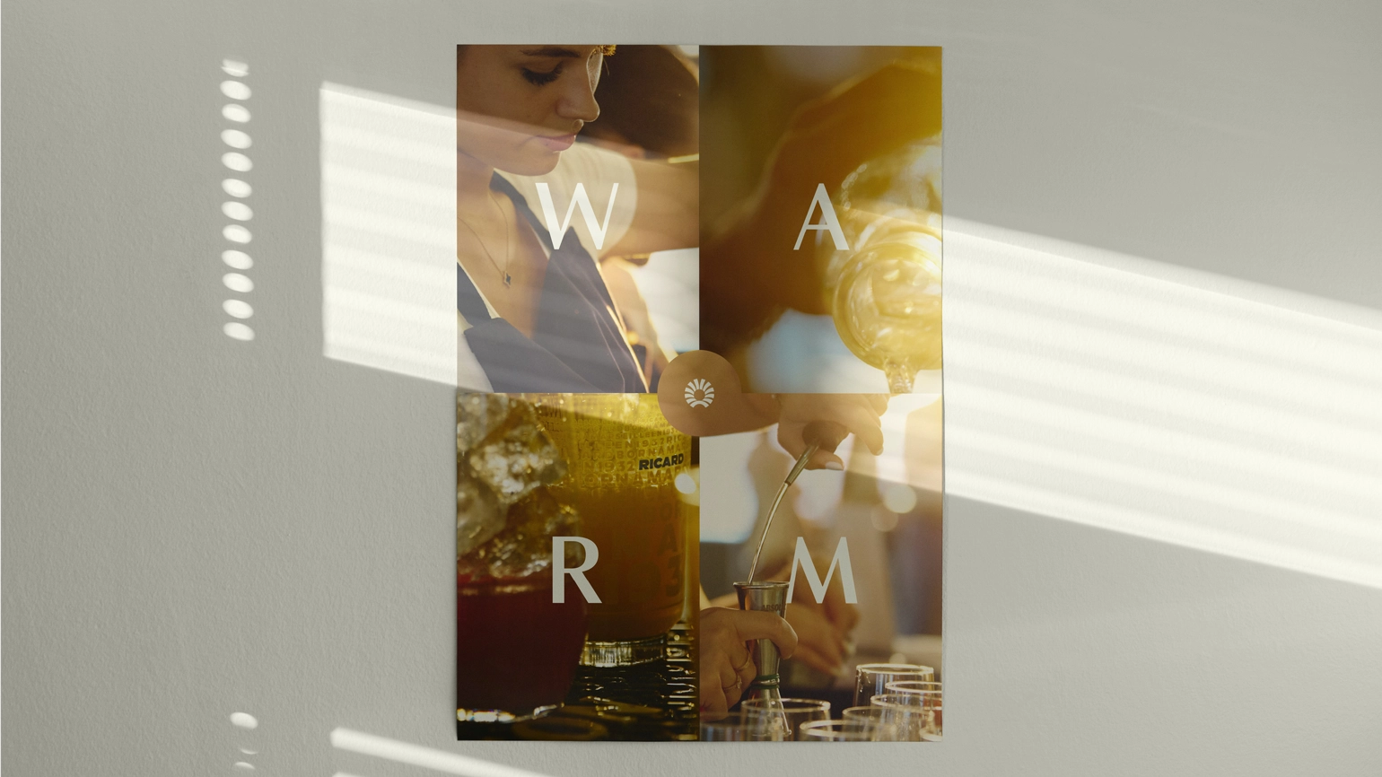
We needed to draw out a compelling, authentic story around conviviality and how it unlocks the magic of human connection. We started with the most recognisable element of the brand, Pernod Ricard’s sun logo. Its shape and symbolism informed the new expression of the ‘glow’ of conviviality, anchored in light and warmth. Leaning into conveying the feeling of conviviality, this approach informed the new visual system, inspiring key graphic elements, colour and photography, to shape a beautifully cohesive identity.

A modern and recognisable leader
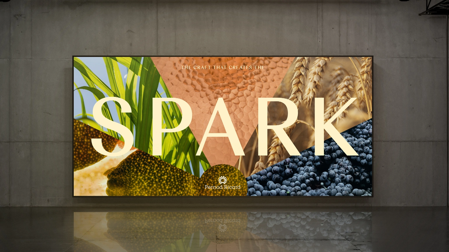
Pernod Ricard’s brand idea has been translated into a distinct look and feel that’s warm, captivating and modern, with a refreshed identity that feels instantly recognisable. As it continues to expand as a global leader, Pernod Ricard is now well equipped with a new set of guidelines across the spectrum of its communications to share and champion the feeling of conviviality with everyone.
